


COGNITIVE DESIGN
The Invisible Visible
In short — Flux blends human-centered design with spatial computing in a speculative AR interface that makes emotional affect visually perceivable.
By translating biofeedback into visual patterns within the user’s field of view, it enables intuitive learning about the interplay between environment, emotion, and the body.
Contents
RATIONALE
Designing for Humans
Unlike most other mammals, humans are born somewhat unfinished. While basic emotions like joy or fear are innate, a stable identity and well-developed emotional intelligence only develop over decades. Schools nurture adolescents intellectually, but emotional intelligence is not part of the curriculum.
However, those able to consciously perceive both their own emotions and those of others are able to respond properly and more wisely. This establishes the foundation for stable, fulfilling relationships.
As a humanist, I put people at the heart of my work, and as a designer, I help them realize their potential. This was my motivation for the Flux project: a speculative AR design that visualizes the somatic responses to everyday interactions and environments, thereby enhancing emotional intelligence to foster a happy life.
The Harvard Grant Study has been following hundreds of participants worldwide, regularly asking about their lives and happiness. Its key finding: positive relationships keep us happier, healthier, and help us live longer.


SOLUTION
Understanding Emotions Visually
Humans are visual beings. We perceive our environment primarily through our eyes and information is easier to process when it’s presented visually. The Flux design concept leverages this principle and explores new technologies to anticipate possible applications, such as in spatial design for augmented reality spaces.
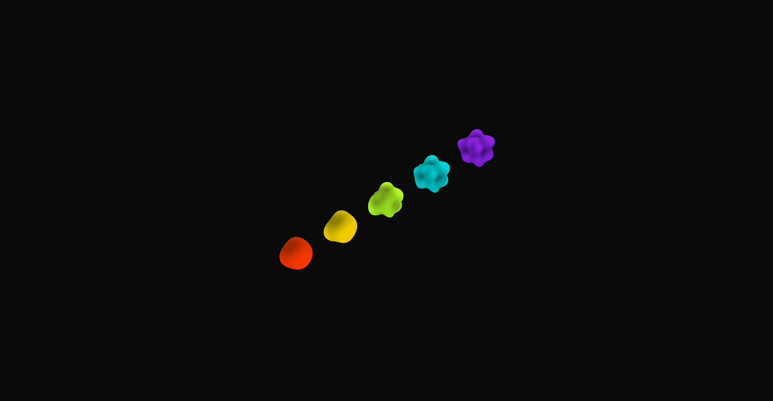
The 3D-rendered Flux sphere visualizes user data collected via wearables along three key physiological dimensions: heartbeat, stress, and energy. These parameters represent an abstraction of underlying physiological dynamics that correlate with emotional affect and influence both the form and behavior of the Flux visualization.
Encoding Emotional Affect
Stress is displayed through the degree of deformation of the sphere as it is associated with restlessness and nervousness. The heartbeat affects the movement dynamics of the sphere through a displacement map that controls the speed at which the sphere changes shape.
The energy level is represented by the terahertz frequency of the coloration in the visible light spectrum: violet, blue, or green tones indicate high to medium energy, while red, orange, or yellow tones signify low to medium energy levels.


From Fiction to Feasibility
The design exists in a speculative augmented reality space and is always visible in the user's field of vision. This enables intuitive, visual learning of the connections between everyday situations, social interactions, specific environments and their influence on emotions and somatic experiences. Enhanced visual perception of situational somatic reactions can thus increase the user's emotional intelligence.
AR contact lenses would be a suitable medium for such a speculative augmented reality space. The fact that this technology is no longer science fiction was demonstrated in 2022 by the Silicon Valley company Mojo Vision, which presented what it claimed was a fully functional prototype for a simple AR contact lens. However, further development was discontinued due to tight capital markets and the yet-to-be proven market potential.
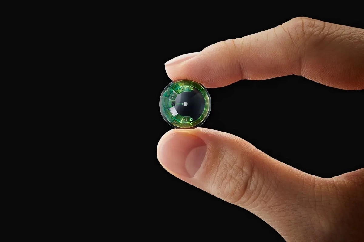
Image Credit: Mojo Vision via VentureBeat
Supplementary information, eg. on non-invasive cortisol level measurement in skin sweat using experimental aptamer sensor technology or on the relationship between other physiological parameters, such as skin conductance and stress, is described in detail in the research paper I authored as part of my master’s degree. The paper lays the theoretical foundation for this project and is available upon request.


LEARNINGS
Mapping Colors Intuitively
Reflecting on this project, a key learning is that the mapping of colors to energy levels based on the terahertz frequency is not necessarily intuitive. A semantic assignment of colors would be more intuitive, so that lower energy levels continue to be associated with red and orange tones and higher energy levels are reflected by yellow and green tones. In retrospect, this could have been realized by simply limiting the upper frequency range to a maximum value of 526 instead of 789 THz.