CONVERSION DESIGN
+12% Signup Conversions
In short — During my time at Crafthunt, I redesigned the signup experience around clarity and trust, which improved conversions by 12%.
A dedicated signup page that conveyed platform value, paired with an engaging, simplified flow, turned hesitation into action.
Contents
INTRO
Joining as First Product Designer
Crafthunt is Europe's largest platform for construction jobs, connecting over 30,000 skilled professionals with 700+ employers. In early 2024, I joined as the first Product Designer with focus on UX.
The mission of Crafthunt is to tackle the labor shortage in the construction sector by bridging the gap between companies and skilled workers. The platform enables companies to position themselves as attractive employers while helping tradespeople find relevant job opportunities.
One of the first things I did in my role was investigate the platform to gain an in-depth understanding — not just of how it was built or how information was organized, but also of the product and business model as a whole.
This helped me identify strategic opportunities for UX optimization and uncover untapped potential that would drive business growth in a structured manner.
CHALLENGE
Breaking the Signup Wall
Job postings — the core value of the platform — are only accessible to users after signing up. This was a strategic decision to ensure high-quality user profiles for better job matching.
However, it also introduced a critical UX challenge: If the signup experience was frustrating, users might abandon the process before ever reaching the platform’s value.
PROBLEM
Clarifying the Platform Value
To better empathize with the user’s experience, I signed up myself. One of the first things that caught my eye during the process was the popup modal used for signup.
Lack of Persuasion — The popup lacked any persuasive elements and failed to communicate that job postings would be accessible after signup.
No Guidance — The entire multi-step profile creation process was contained within the popup, with no clear navigation or progress indicator to orient users.
Best practices suggest that popups should not be used when user input extends beyond a single action, such as entering an email. A dedicated signup page provides more space to persuade users and guide them through the process.
Additionally, popups have long been associated with intrusive ads, which conditions users to instinctively dismiss them. This automatic behavior further decreased engagement and increased abandonment rates.
USER BEHAVIOUR
Validating My Assumptions
Taking a closer look at user behavior on the website using the embedded product analytics tool PostHog confirmed my assumptions and revealed that only 6% of users who initiated the signup process by clicking ˈSign up for freeˈ actually completed it. On mobile, the number was even lower.
This critical conversion rate raised an important question: Why were users abandoning signup, and at which steps were they dropping off?
To better understand user behavior, I created a customized report that mapped out each step of the signup journey and identified where users were leaving. Two major drop-off points became evident:
Early abandonment — A large number of users exited the process almost instantly after the popup appeared. By reviewing click recordings, I found that many users either closed the modal immediately or presumably clicked outside of it by accident, unintentionally dismissing the signup flow. This suggested that the popup format itself was contributing to abandonment.
Trade selection drop-off — Another significant drop-off occurred at the trade selection step. Users were required to choose their profession from an overwhelming, unsorted grid of categories, presented with no search function or progressive disclosure. This potentially led to frustration and a high exit rate.
The combination of an easy-to-dismiss signup modal and a cognitively demanding selection step are strong indicators that the signup process itself was a key barrier to conversion.
Defining the North Star
Signup conversion, as potentially the strongest lever for platform growth, highlighted the need to reduce friction within the signup flow. Data indicated that early abandonment was the primary issue — users were dropping off before even engaging with the signup process.
Before designing a solution, I formulated three hypotheses to guide discussions with my product manager and team to structure the design process:
Early abandonment — The popup-based signup flow led to instinctive dismissals, either because users associated popups with ads or unintentionally clicked outside the modal, closing it.
Cognitive overload — The trade selection step overwhelmed users with an unsorted, endless grid of categories, making selection difficult and discouraging completion.
Popup modal misfit — The popup format exceeded its capability to contain a multi-step signup process, lacking a progress indicator and creating a frustrating user experience.
These insights were foundational to the redesign of the signup flow, minimizing drop-offs and improved engagement.
Refining the Signup Experience
Over the course of a week, I committed to daily iterations guided by feedback from my product manager and engineers — from initial sketches to final handoff.
In the weekly company standup on Friday, I presented the new dedicated signup page that replaced the popup, along with a streamlined, user-friendly signup experience.
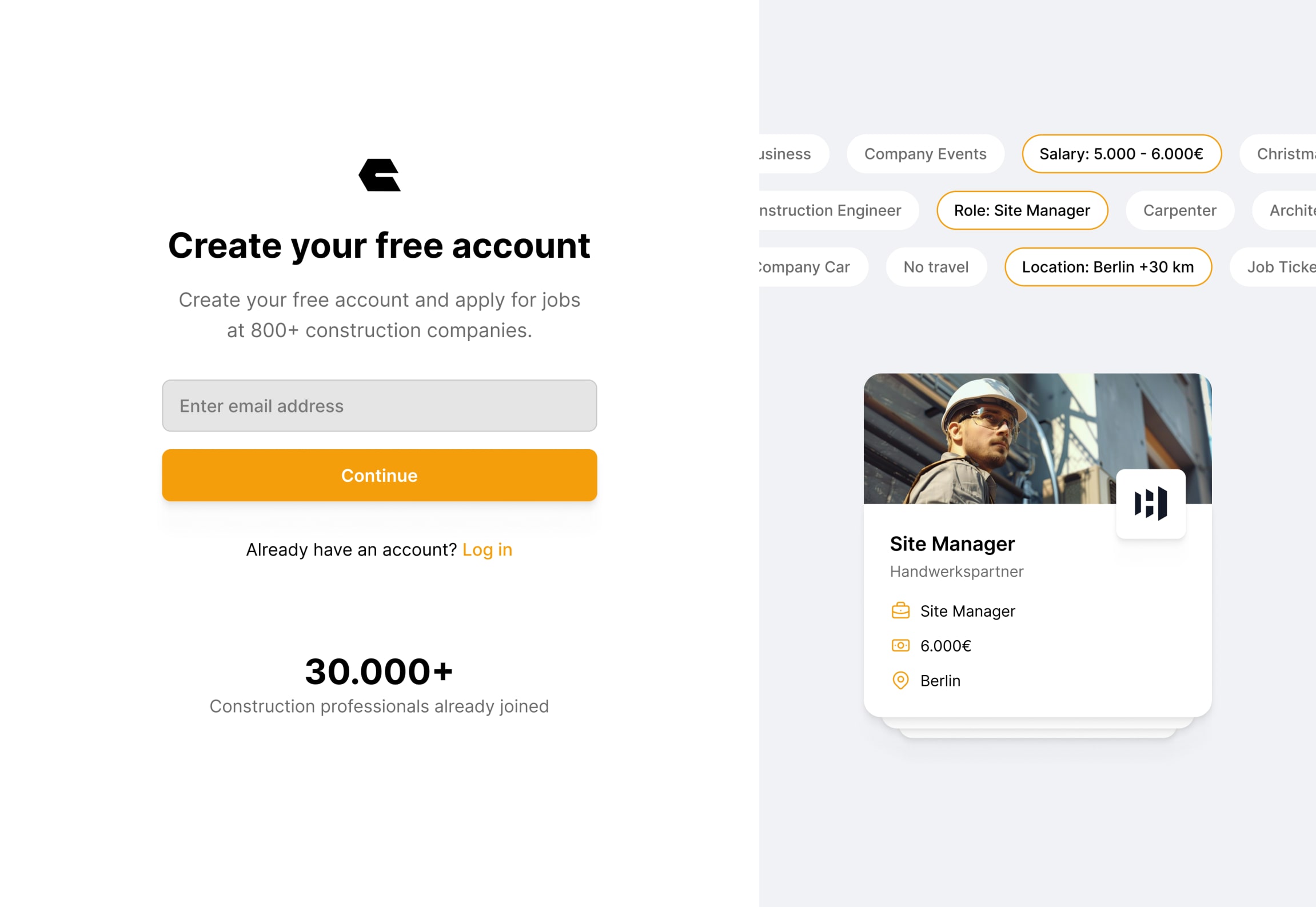
Standalone Flow — The signup process was moved to a dedicated page with persuasive headline, supporting copy, and visuals, reinforcing the value of signing up.
Improved Usability — The trade selection step was redesigned with search functionality, logical grouping, and progressive disclosure, making it more intuitive and less overwhelming.
Clear Orientation — A progress indicator was introduced to set expectations and reduce uncertainty.
The new signup initiation screen was crafted with a persuasive headline, supporting copy, and real job postings to establish trust and motivation. Instead of forcing users through an enclosed, modal-based experience, they were guided through a structured one-step-per-page signup flow.
To tackle cognitive overload, I worked with my product manager to implement a sorting logic that pre-selects the most relevant trades based on the chosen profession. This reduced the need for users to sift through an extensive, unsorted list.
Additional trades were accessible through progressive disclosure, minimizing initial complexity while still allowing for customization.
Finally, the prominent progress bar provided users with a clear sense of completion, keeping them engaged throughout the process.
A/B Testing the Redesign
To validate the outcomes of the design sprint, I teamed up with the engineers to set up an A/B test comparing the new signup experience to the original. We designed the experiment so that 10% of users would initially be exposed to the newly redesigned variant B.
After just a day, the results showed a statistically significant improvement in performance over variant A, validating my hypothesis.
Based on these early findings, we progressively ramped up exposure throughout the week until the new flow was live for all users.
Delivering Measurable Impact
With the new signup page and streamlined flow, signup conversion increased from 6% to 18%, a +12% improvement within just a few days after implementation.
Smoother Progression — Users moved through the signup process more efficiently, resulting in fewer drop-offs.
Reduced Overload — The new trade selection flow minimized cognitive strain, making profile creation smoother.
Direct Impact — The measurable uplift in qualified signups contributed directly to business growth goals.
By removing friction, improving clarity, and adding motivation, the redesign ensured that users reached the platform’s core value — job postings — faster and with less frustration.
This validated the hypothesis that a dedicated signup experience, structured guidance, and clear progress tracking significantly impact conversion rates.
The success of this redesign showed that aligning business goals with user experience improvements creates a win–win, where reducing friction benefits both users and long-term growth.